During my spare time, I decided to draft up a logo for the team. Here it is:

Design
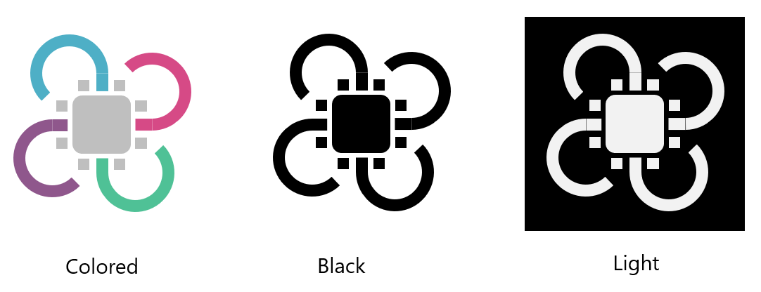
The design of the logo consists of two main parts: the grey circuit board in the middle, and the four arcs surrounding it. The overall design resembles our project: an FPGA accelerated computing platform on a multirotor / quadcopter.
Each of the arcs have a different color and meaning which makes up the key components of the success of the project. Each of the arcs converge at the center, symbolizing we emphasis on the system integration of all the components.
- The top left (blue) arc represents implementation of ML model or hardware acceleration of ML models on FPGA. The color is blue to symbolize the smooth integration of hardware and software as flowing water.
- Bottom left (lilac) arc represents the quality, mobility / portability of the computing platform. It is colored lilac to symbolzie user-comfort and ease-of use. In many parts of the world, purple is considered an “royal” color, this symbolizes the our intent to pursue quality.
- Bottom right (green) arc represents the growth and longevity of the deliverables of the project. The project is for the client’s research. The green color symbolizes growth.
- Top right (bright maroon) arc represents competent leadership, engineering, decision-making, and teamwork. The color is a hue-shift from UBC’s red, which represents the faculty of engineering. It is also a reminder to the team that everyone is expected to practice the engineering code of conducts.
There are eight pins (non-including ones connected to the arcs) for the chip in the center. Each of the pins represent the team member and the stakeholders of the project (5 team members + 1 instructor + 1 TA + 1 client).
Usage
The logo comes in three-variants for usage depending on the context and document design.
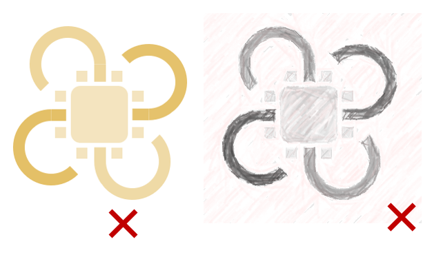
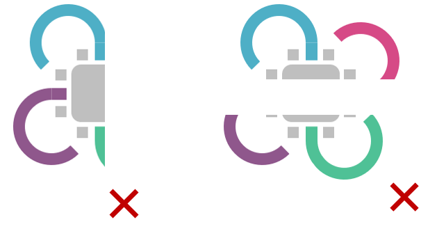
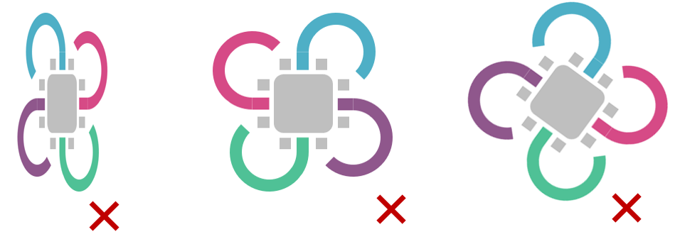
Do not crop the logo.
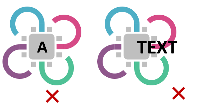
Do not overlay text on top of the logo inside its bounding box.
Do not stretch, flip, or rotate the logo.
Do not apply image filters or post-processing effects to the logo.